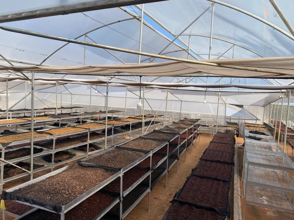
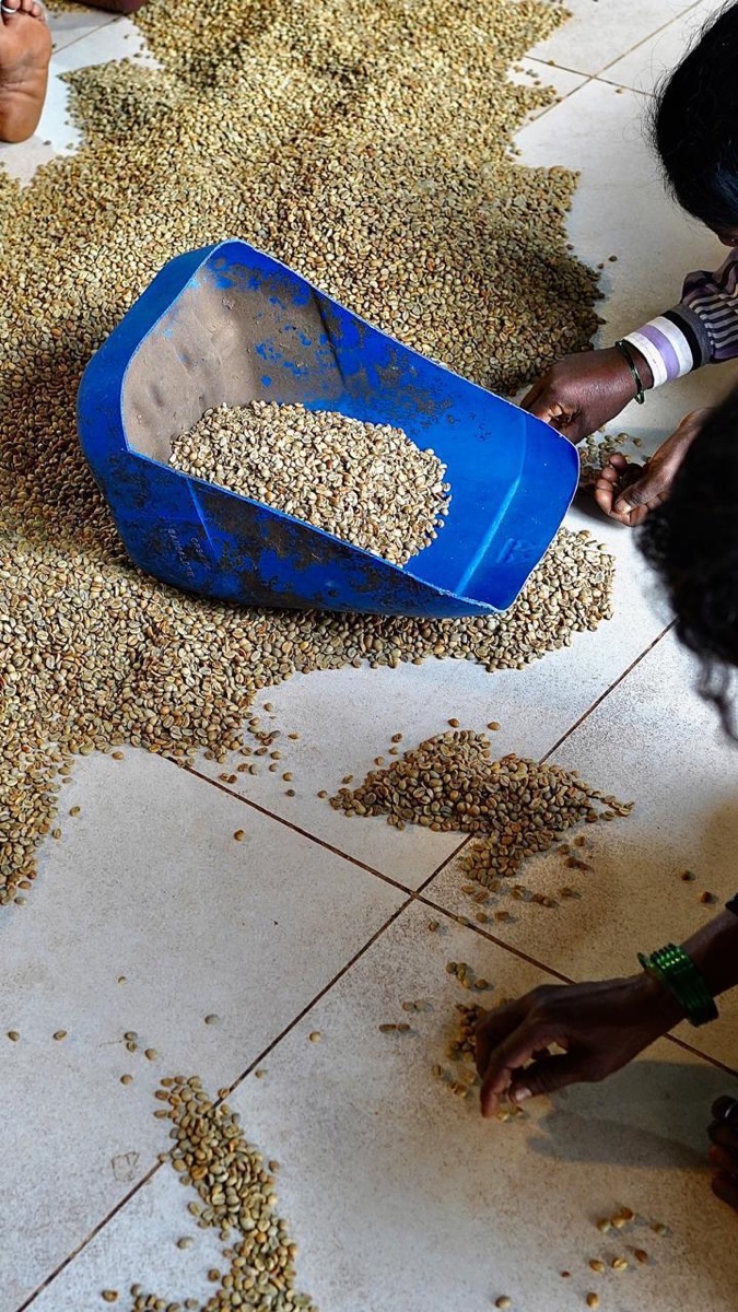
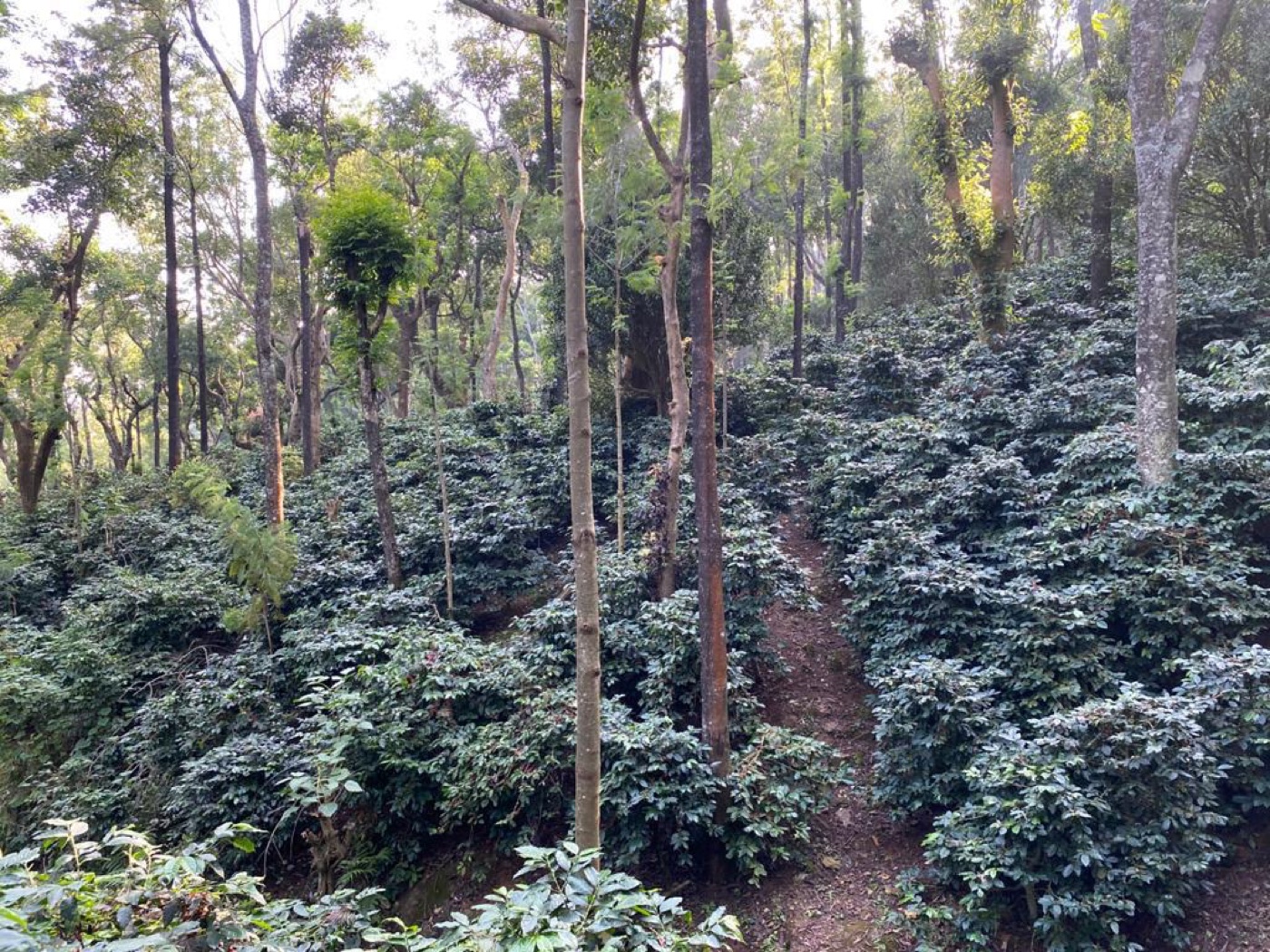
Kuyil Origins started with a simple idea. We wanted to share a fuller story of Indian coffee, one that goes beyond the cup and speaks to the people, places, and traditions behind it.
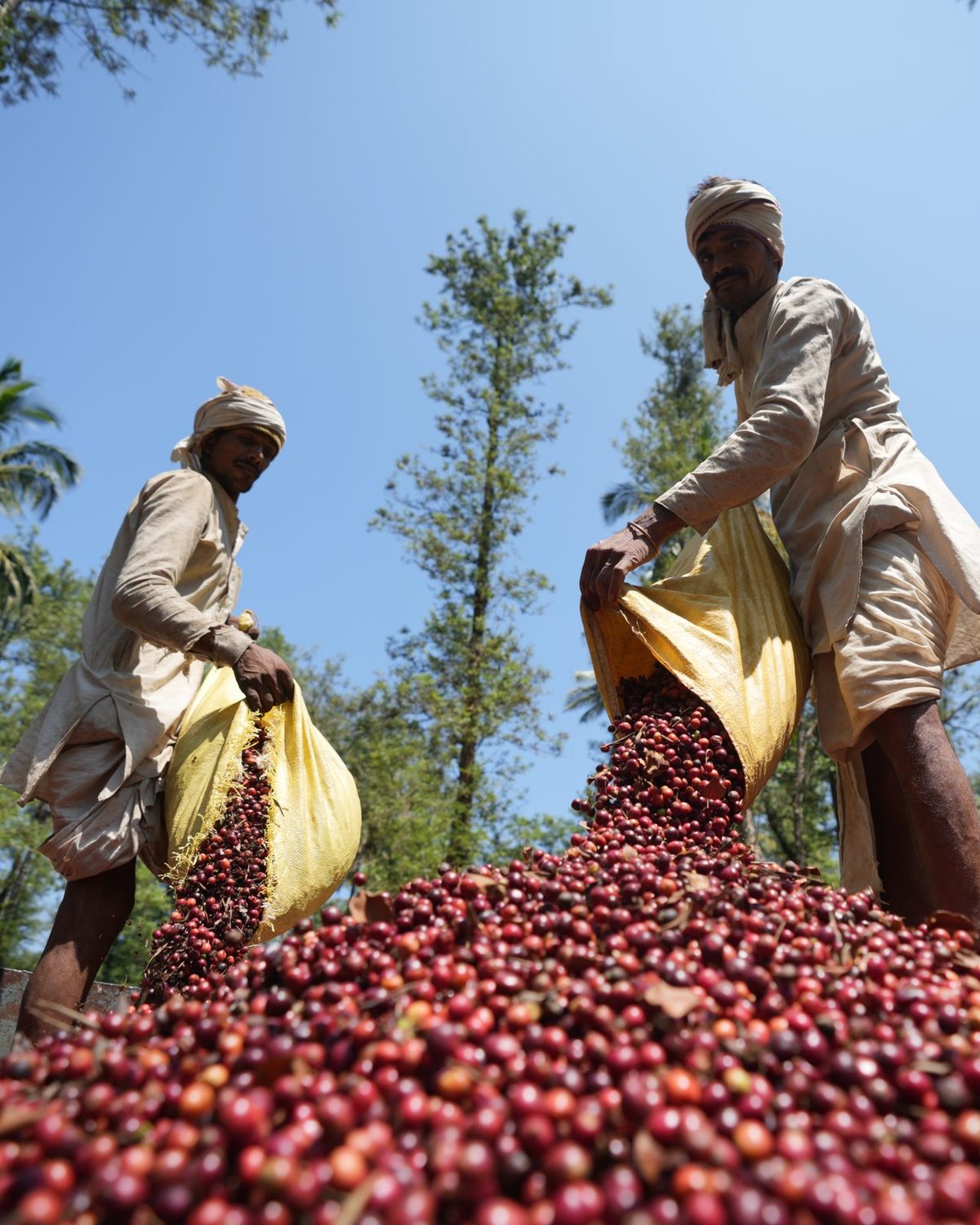
The Coffee
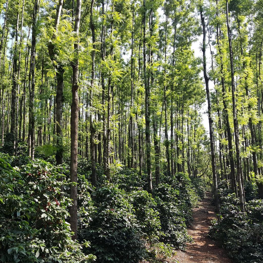
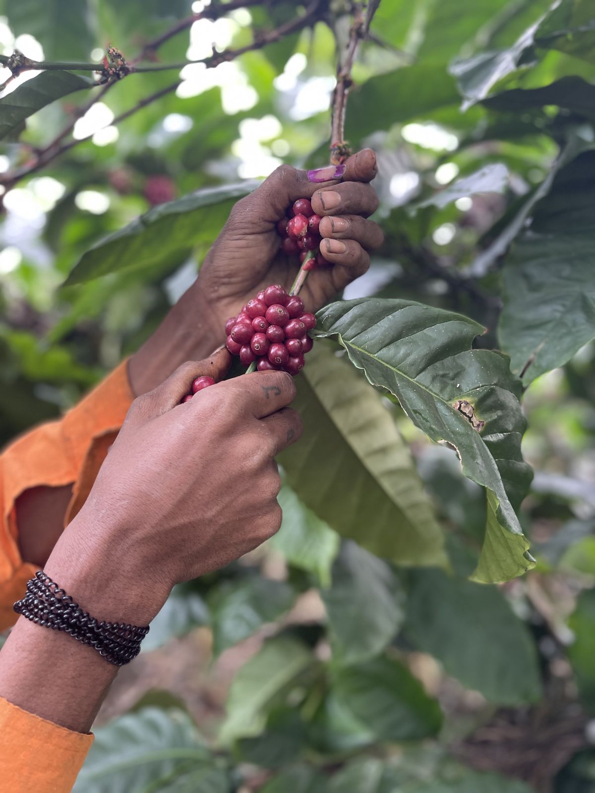
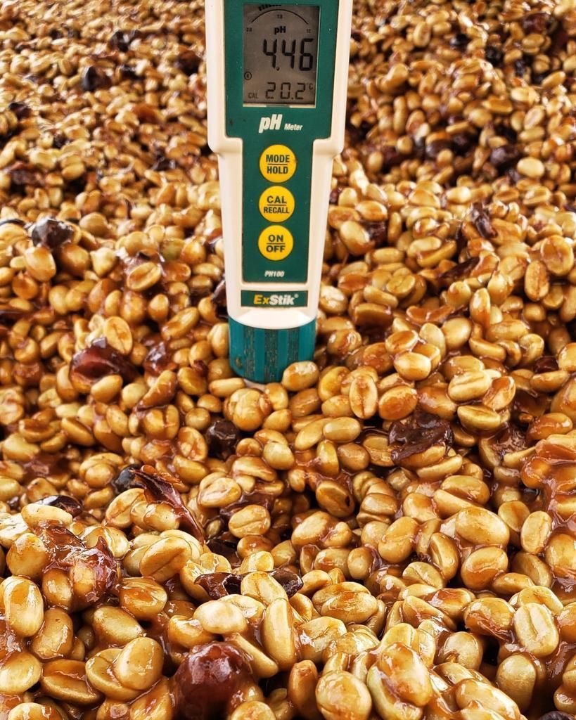
The coffees we choose come from time spent at origin. We visit estates, walk through the farms, cup with producers, and learn how each lot was grown and processed. We look for coffees with character, clarity, and a strong sense of place.
The Kuyil
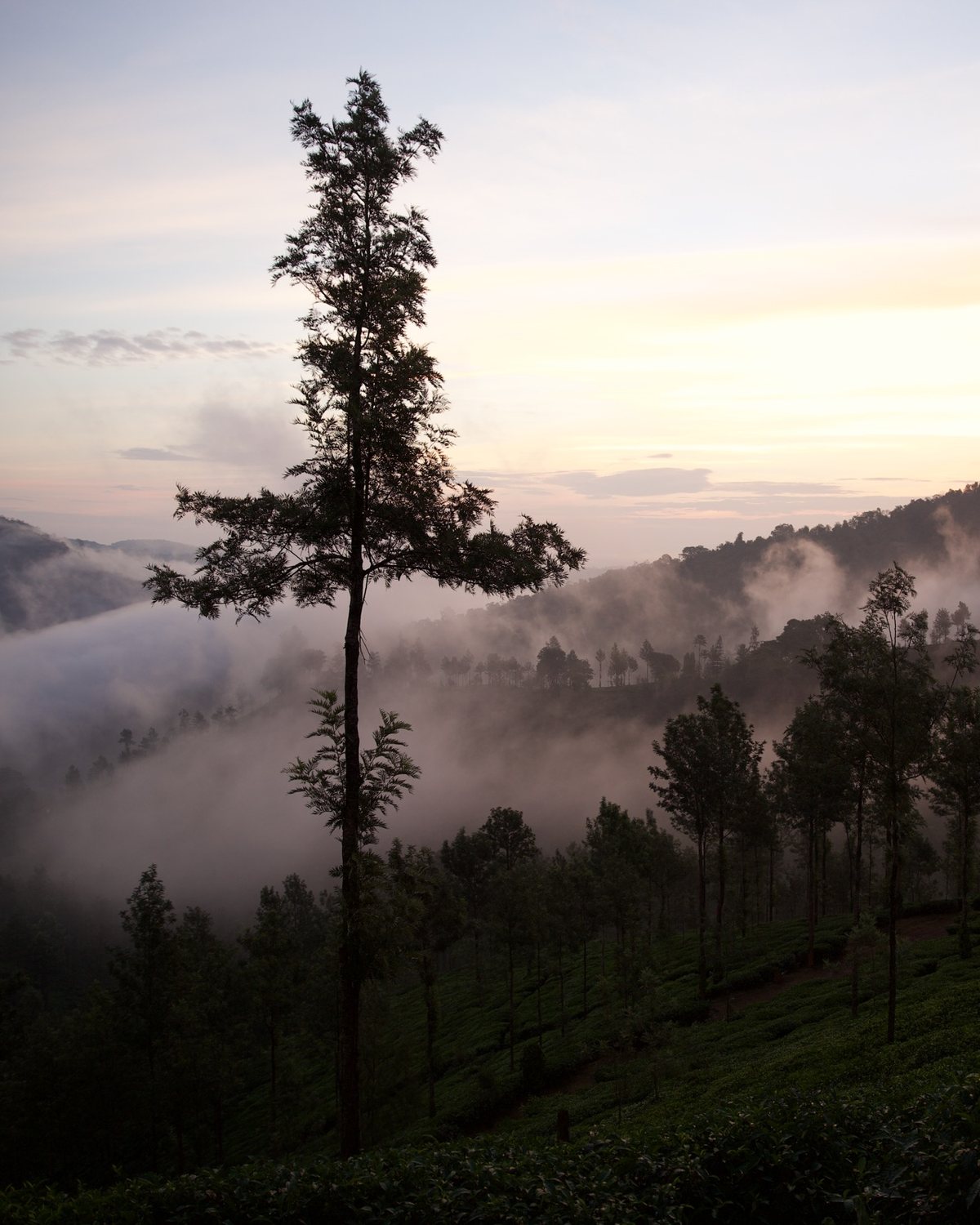
The name Kuyil comes from the koel, a bird that is deeply familiar across India. Its call has been part of poetry, music, and storytelling for generations, often associated with spring, longing, renewal, and the changing of seasons.
In India’s coffee-growing hills, the kuyil becomes part of the rhythm of blossom season. After the first rains, coffee trees burst into small white flowers and the valleys fill with a fragrance that is almost jasmine-like. Around the same time, the call of the kuyil carries through the trees. It is a brief but beautiful moment when the landscape feels completely alive. That feeling became an important part of the Kuyil identity.
The Mark

“Almost as though it could have been carved, drawn, or discovered.”
A mark that feels discovered
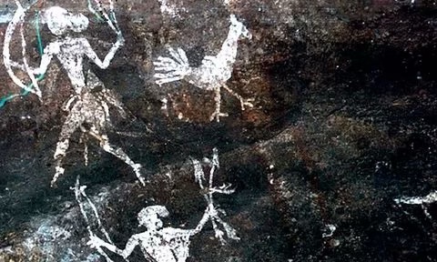
We were drawn to the simplicity of early rock imagery, where a few lines could hold the shape and character of a bird. That sense of something handmade, imperfect, and enduring became an important starting point for Kuyil.
An older visual language
The identity looked to ancient rock art traditions from India, especially the way birds, animals, and people were recorded through simple forms. We wanted the mark to carry some of that same honesty and restraint without copying any one image directly.
A connection to Georgia
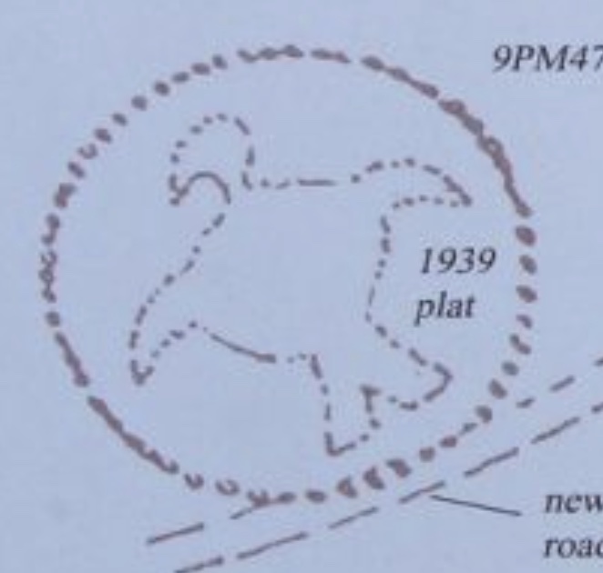
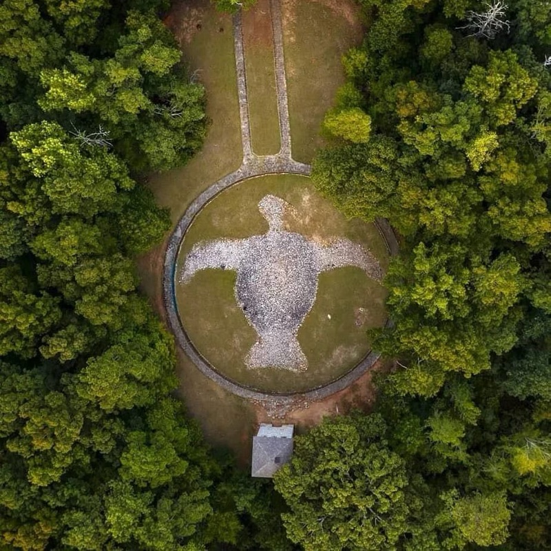
The research also led us to the Rock Hawk Effigy in Georgia. Seen from above, the bird becomes part of the land itself. That felt meaningful for a brand whose story begins in India and is now taking shape in Atlanta.
Form and structure
Historic drawings of the effigy helped us think about silhouette, proportion, and the idea of a symbol that can be read almost like a mark on the landscape. Those ideas helped guide the structure of the final bird form.
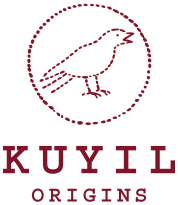
The Kuyil mark
Our logo brings those references together in a quieter way. The small forms within it resemble coffee beans, a subtle nod to what sits at the heart of Kuyil. The larger shape draws from ideas of land, memory, and marks left behind over time.
It connects two places that shape the brand: India, where the coffees begin, and Atlanta, where Kuyil is taking root.
We wanted the mark to feel timeless rather than overly polished, almost as though it could have been carved, drawn, or discovered. That balance felt right for Kuyil.
Kuyil Origins is our way of connecting those places through coffee. Each lot carries a story of land, people, process, and season, and we want to share that story with the people who roast it, brew it, and drink it.